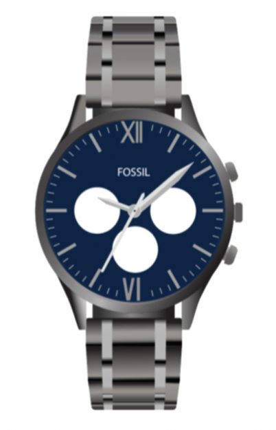
Every project has a purpose. For some it may be a fun personal challenge, for others, it could be an assignment or a contract. For this project, it was a little bit of both. The assignment was to create a photo-realistic watch, but I took this as a personal challenge to push myself and do something I had never done before. As I went through this process I realized there was so much that I did not know when it comes to Adobe Illustrator. My process goes as follows as I attempted to create a Photo-realistic Fossil watch.
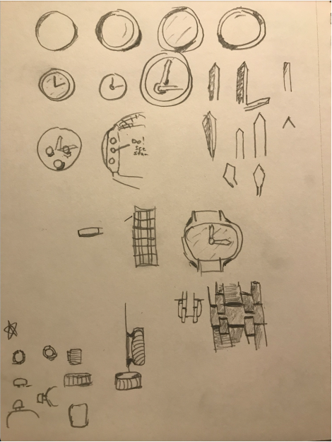
After choosing the model of watch I was going to use I started with some sketches. Although I already knew what this watch was going to look like, I needed to draw out the shapes, shadows, and highlights I saw so I knew where those things would go. Rather than having a thousand different ways of looking at the same thing, I dialed down my sketches to really get the shadows and shapes down. This helped me get started actually executing the watch in illustrator as I knew what shapes to use and how to style the shadows.
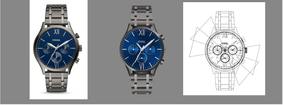
I after a few days of trial and error actually learning how to make those shapes I had already drawn, I finally had my first draft.
Suffice it to say, it was a rough draft. I had only messed with shapes and a tiny bit of shading, but I wanted somewhere to start before I dived into the highlights and shadows. I showed this draft to some people and got some mixed reviews, most of which were far from complete, but I knew that. It helped me to see where I needed to go next in my progress and gave me some good direction.
For my second draft, I made a lot of progress. I was able to work on the band as well as the watch face, but was still lacking on the mini clocks, the outside glass, and finishing the highlights. I got some feedback on what to do for the shadows on the band, and also on how to do a cool bowtie effect on the mini watches and glass, and then spent many hours tweaking and editing my watch into the final product.
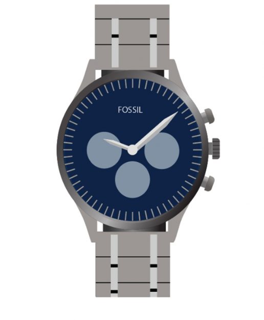
After many hours I finally finished. I was able to take the feedback I was given and make the needed adjustments to finish it off. I was able to figure out how to do the bowtie glass shapes on both the small clocks and the overall outer glass, and was able to bring everything together. I showed my final product to a few people and 60% of the time at first glance were not able to tell that the difference between the reference photo and my vector graphic. There are still some differences as I didn’t want my watch to be exactly the same, but the shadows, highlights, and shading make for one convincing end result. I had a lot of fun with this project and am really excited for the next one. Bring it on.