















Notice: Function _load_textdomain_just_in_time was called incorrectly. Translation loading for the jetpack domain was triggered too early. This is usually an indicator for some code in the plugin or theme running too early. Translations should be loaded at the init action or later. Please see Debugging in WordPress for more information. (This message was added in version 6.7.0.) in /home2/jaredrig/public_html/wp-includes/functions.php on line 6131

Warning: Cannot modify header information - headers already sent by (output started at /home2/jaredrig/public_html/wp-includes/functions.php:6131) in /home2/jaredrig/public_html/wp-includes/feed-rss2.php on line 8
jrigby18, Author at Jared Rigby Design https://jaredrigbydesign.com/author/jrigby18/ Welcome to my Portfolio Wed, 13 Jul 2022 17:45:21 +0000 en-US hourly 1 https://wordpress.org/?v=6.9.9 https://jaredrigbydesign.com/wp-content/uploads/2025/04/cropped-Black-Logo-32x32.png jrigby18, Author at Jared Rigby Design https://jaredrigbydesign.com/author/jrigby18/ 32 32 18 Days of Mascot Logos https://jaredrigbydesign.com/18-days-of-mascot-logos/ https://jaredrigbydesign.com/18-days-of-mascot-logos/#respond Wed, 13 Jul 2022 17:45:21 +0000 https://jaredrigbydesign.com/?p=749 Please view this pdf of my case study to read more. 18 Days Case Study

The post 18 Days of Mascot Logos appeared first on Jared Rigby Design.

]]>
Please view this pdf of my case study to read more.

18 Days Case Study

The post 18 Days of Mascot Logos appeared first on Jared Rigby Design.

]]>
https://jaredrigbydesign.com/18-days-of-mascot-logos/feed/ 0
Fishbowl https://jaredrigbydesign.com/fishbowl/ https://jaredrigbydesign.com/fishbowl/#respond Wed, 13 Jul 2022 17:29:45 +0000 https://jaredrigbydesign.com/?p=732 I had the opportunity to work on a short film titled Fishbowl, this past summer. I had a mentor who introduced the idea of working on a short film, and since the opportunity presented itself, I jumped on it. There were 12 people that would be working on 3 separate short films, so started pitching […]

The post Fishbowl appeared first on Jared Rigby Design.

]]>
I had the opportunity to work on a short film titled Fishbowl, this past summer. I had a mentor who introduced the idea of working on a short film, and since the opportunity presented itself, I jumped on it. There were 12 people that would be working on 3 separate short films, so started pitching our ideas.
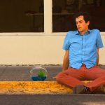
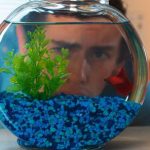
After some voting and discussion, I chose to work on the Fish Bowl. Fish Bowl was a film written and directed by Sam Marzzarella, and It features a young man named Simon who would very much like to stay at home (forever), as well as a mysterious talking fish who kicks off an unforgettable adventure when he appears on Simon’s doorstep.
After our team was established, we set up the main roles that we would then be working on for the remaining 10 weeks of the project. I was able to be the on-set sound operator to ensure we had good sound, as well as my main responsibility, which was the editor.
We had a few weeks of preproduction that we had to do in order to be successful. We wrote and rewrote the script, created storyboards, hired actors, and contracted out locations. We were lucky to have a great location to film all the inside scenes. We then contracted with the City of Rexburg Idaho to allow the filming of the outdoor locations.
We spent most of our time with the preproduction so that we could get everything filmed in the 4 days of shooting. After each day of shooting, I would take the footage and begin with the edits, so that the outline and story could be told.
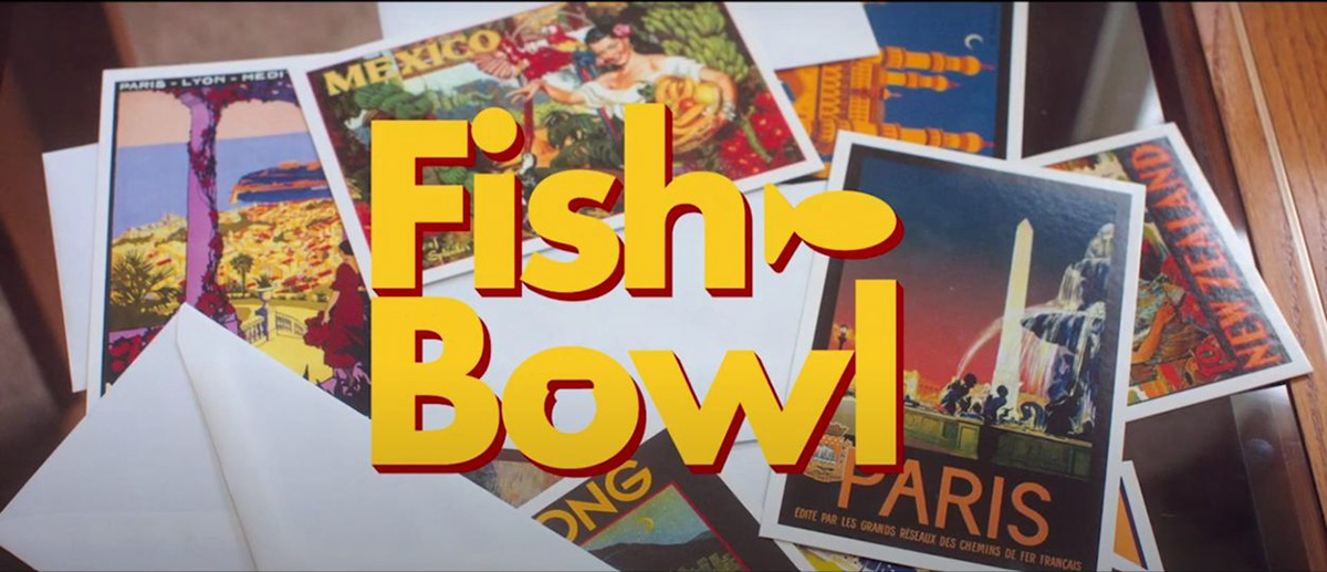
As part of the process, we also made a trailer that we used to advertise and promote our film.
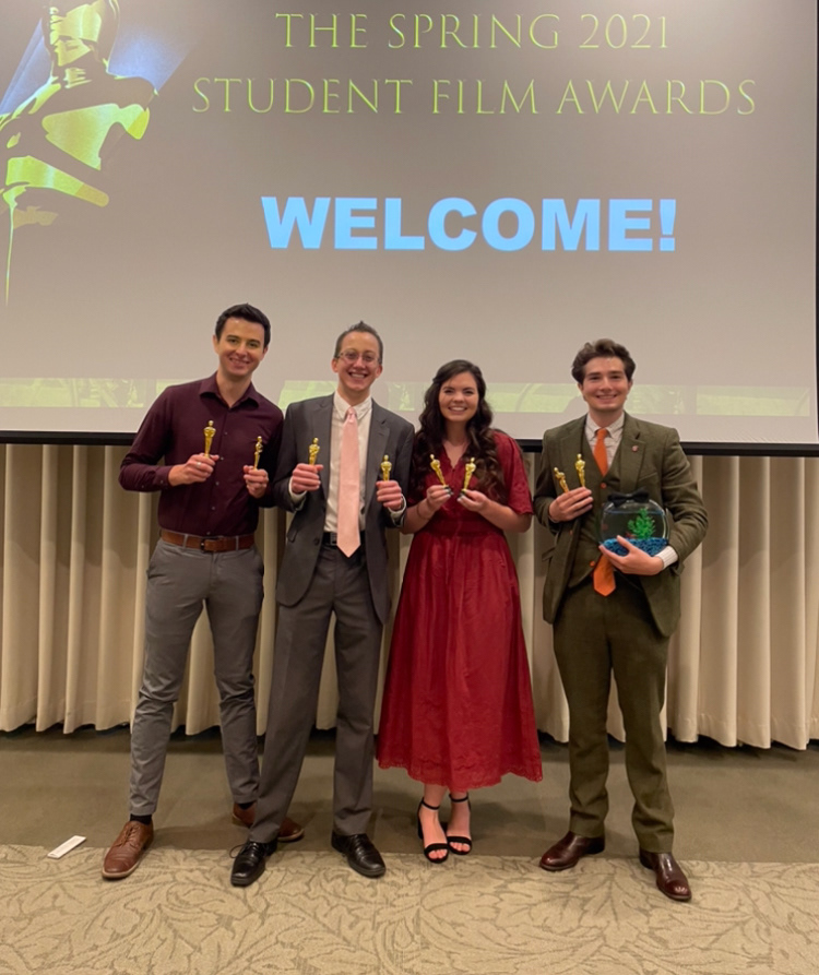
Then at the end, we had a movie premier where we watched all 3 of the short films made during the project. At this premiere, we also had an awards ceremony where the best film aspects were chosen by other video professionals. Out of the 8 awards ranging from best actor to best story, Fish Bowl was awarded all of them.
I had a ton of fun being able to piece this film altogether. I spent hours with my team editing, splicing, changing audio, and adjusting levels so that the color corrector could put his edits over our structured film. I am grateful for the chance I had to work on this film, and without further ado, here is Fish Bowl.

The post Fishbowl appeared first on Jared Rigby Design.

]]>
https://jaredrigbydesign.com/fishbowl/feed/ 0
18 Days of Logos https://jaredrigbydesign.com/18-days-of-logos/ https://jaredrigbydesign.com/18-days-of-logos/#respond Wed, 13 Jul 2022 16:49:47 +0000 https://jaredrigbydesign.com/?p=708 Mission Impossible Sometimes we are given the challenge to do something hard. However, no matter how difficult those things are, they are how we learn. I wanted to challenge myself by practicing my skills with logo design. To do this, the 18 Days of Logos project was born. 18 Days of logos mean that every […]

The post 18 Days of Logos appeared first on Jared Rigby Design.

]]>
Mission Impossible
Sometimes we are given the challenge to do something hard. However, no matter how difficult those things are, they are how we learn. I wanted to challenge myself by practicing my skills with logo design. To do this, the 18 Days of Logos project was born.
18 Days of logos mean that every day for 18 days, I needed to complete a finished, refined logo for a fictitious business. Each day I would have 24 hours to go from idea to executed design. This was something that was going to push me. It was going to try me. It was going to put me to the test. Though I knew that in the end, it would all be worth it.

brand identity Logo Design logos Logotype visual identity
Outcome

Completing this project was not easy, but there were a lot of great moments. Besides seeing my designs go from ideas on paper to a full-on logo, I am in possession of 18 additional pieces to add to my portfolio. I am better at managing a difficult project, more experienced with using Illustrator, and overall I am a better designer. I am also more confident in being able to showcase my work to others. Though it was hard, the results made it worth it. Let’s get into how it all came together!

Just like when you are getting ready for a trip, I needed to prepare to ensure I was ready for this project. To make my life as easy as possible, I explored a bunch of different ideas for different businesses that could use a logo. I used these ideas to assemble a list for me to choose from when the time came to sketch.

The next step in the preparation was to start sketching. I grabbed myself a sketchbook and went to work. I spent an average of two pages per business idea in order to give myself room to explore and refine. I decided to put more focus on refining my sketches in pen on a separate page from the others. This allowed me to have more organization in my sketching, leading me to pick the best design to move into the software.

Doing my sketching like this helped me out a ton because it kept my brain from getting distracted by my ideas. This helped me reach a more refined version so that when I completed each day’s logo, I could simply look ahead through my sketchbook and pick the next day’s work. Once the time came the following day to begin work, all I would do is grab a screenshot of my sketch, move to the software and begin the execution.

MOCKUPS

After I finished with my sketchbook and had a solid set of ideas, I did some additional searching and found some free-to-use mockups in order to help showcase my designs. I was able to find more than enough options to have a different mockup for each of my logos – though I didn’t use all of them. I’ve found that putting my logos into a mockup really helps elevate the look and feel of a design when it’s put into the appropriate context. With my sketching done and the mockups found, I was ready to begin and start with the creation of my 18 logos.


FINAL LOGO PREVIEW

brand identity Logo Design logos Logotype visual identity

Highlights 

Day 1

While I am proud of all of my designs, the following three days best highlight my process. Each of these days had its own challenges, but the end results show how I was able to overcome those struggles and learn from them.
Naxus Watches was my first day – and it was definitely one of my best. I chose to start with this for the main reason that it was one of the more “finalized” sketches that I had, so I hoped that starting with this one would help me test to see if my preparation was enough, and it was!
I was able to take a screenshot, drop it into Illustrator, and then make a rough draft version of my sketch very quickly. The end goal for this logo was to combine the two letters, N and X, together to form the main shape. I met with a mentor who helped me make sure that my angles were unified, the sizing matched, and the letters were more recognizable.
I made some adjustments to improve how it all looked, and in the end, my tweaking strayed from my original design. Though it is different, that’s okay! My final design is better because the shaping of the letters also creates the outline of an hourglass, which matches with the watch theme perfectly.
Now that my first day was complete, there were already lessons that I learned. I was already seeing the power that meeting with mentors and getting feedback can have on elevating my designs, so I intended to continue to do this throughout this project.
I also saw that my final design was different from what I initially thought, but the end result was better. I would have to learn to let go of any sketches if they didn’t work out as well, in order to allow for the best results to come forth. And there were some days where that needed to happen.
Finally, my plan was working. By completing day one, I was pretty much already good to go for the next day. I flipped through my sketchbook, picked another design, did some mental prep, and was ready to start on it the following day.
Day 3
I was super excited about how the idea for my day three came to be, and how everything came together so well due to my preparation. I came up with the idea for a construction/lumber company-based logo while on a road trip. As I kept driving past more and more trees, the idea to have a tree be the compass came to my mind. I had no idea what that would look like though, so I needed to sketch out different variations.
In my exploration, I liked the idea of the solid tree shape being the centerpiece of the compass. However, like with my first day, the final varied from the initial sketch quite a bit. While I had done the needed sketching, I found that I do a lot of my best refining in software. Since I can create endless copies, I can quickly do more exploration to get the best result. I played around with different shapes, different amounts of trees, the location, sizing, and all sorts of other things.
In the end, after some additional feedback from peers who told me to keep it simple, I ended up with my final design. Although this still felt slightly off in my mind. I wasn’t entirely sure how well this would work in the real world, so as a test I dropped it into a mockup of a truck that I had found. This turned out to be the best decision for this day.
By putting it into the mockup, I could see the context for where others would see it as well. The compass shape, the title, and the mockup finally made my brain click that this looked good. I showed my logo/mockup to some others, and they all agreed that this was something that they would expect to see in the real world. It turns out that my logo worked out after all.
I wasn’t quite done though, as I made some small minor adjustments to the sizing of objects to make sure it looked as good as possible on the mockup. This helped me to realize that while my brain may say that something is bad, it may just need the appropriate context to convince myself and others that it works. Mockups are a great way to showcase designs, and I was grateful that I had done the research to find so many different mockup options in my preparation stages.

Day 15

Towards the end, one of the hurdles became the greatest reason I was grateful for having a backup plan. I originally started out the day with the idea for some sort of activewear clothing line. Besides a couple of sketches that I had, I didn’t have much else to go off of. I started with my initial sketch but quickly ran into an issue. During my execution process, I was looking up examples and saw that my idea wasn’t very original. It had been done before. Since I wanted to stay unique, I needed to go change things up. I considered different ways on how I could adjust what I already had, but ultimately I made the decision to scrap that idea.
I looked back through some other sketches I had done for this idea and found one that looked simpler, but way better at the moment. I gave this one a go and the rest is history. This became my final for the day, and I am happy with how it turned out. This wasn’t the only day where I ended up changing some ideas or relying on backups, but this one for sure takes the cake because I was so invested in my initial idea. I was hesitant on trying to change gears so late in the day, but by having this backup idea, I knew I could do it with relative ease. In the end, it all worked out. I used my backup and ended up with a real solid logo that looks really nice on mockups.
Thanks go to my preparation for making this one possible, I am so glad I had a solid backup already in place without me even knowing. One might think that so late into the project I would have things nailed down, but you never know what can happen. That’s why I prepared! I was ready for the unexpected.

Wrapping up

From this project, I learned two very valuable lessons. First, is the importance of thorough sketching. In my preparation, I did much more than I had ever done before, and it made completing this project much simpler. There is still room to improve on doing more effective design exploration and refinement, but I am happy that I had so many ideas.
This leads directly to my second lesson, how critical backup plans are. Giving myself that cushion meant that on the days when my initial designs didn’t feel right or were downright bad, I knew I could still complete that day’s design within the given parameters.
Did these two things make the project super easy? Not at all. This project still pushed, tried, and stressed me out more than I would care to admit. Yet I am now able to say that I have done a hard thing! I completed 18 brand new designs within 18 days – and man it feels good. It’s always the toughest challenges that are the most rewarding, and this project was worth it. Besides the big lessons mentioned, I’m more confident in my abilities as a designer and am ready to take on the next challenge.
So have a mission for me? Send me an email or give me a call, and let’s chat. I’d be happy to work with you.

Jared Rigby


Jaredrigbydesign.com


Jared.rigby18@gmail.com


208-313-3389

The post 18 Days of Logos appeared first on Jared Rigby Design.

]]>
https://jaredrigbydesign.com/18-days-of-logos/feed/ 0
Legendary Icons https://jaredrigbydesign.com/legendary-icons/ https://jaredrigbydesign.com/legendary-icons/#respond Fri, 29 Jan 2021 04:11:54 +0000 https://jaredrigbydesign.com/?p=503 Legend of Zelda could easily be considered one of the most iconic game series of all time. With more than 15 games to date, the franchise has been apart of people’s lives for a very long time. My goal for these icons that I created is to showcase one of the most classic editions of […]

The post Legendary Icons appeared first on Jared Rigby Design.

]]>
Legend of Zelda could easily be considered one of the most iconic game series of all time. With more than 15 games to date, the franchise has been apart of people’s lives for a very long time. My goal for these icons that I created is to showcase one of the most classic editions of the series, Ocarina of Time. Old-timer fans of the will recognize the iconic items found while playing through, and to put it lightly there was a process involved to make these.


Starting with the sketches I got to work. I originally went through nearly 5 different ideas all surrounding Zelda that I could use on my theme, and after speaking with a friend who also happens to be a huge fan of the series, he helped me land on Items, so I sketched away. The sketches I included are only a small portion of all the different sketches, but due to an accident, some versions were lost before they could be digitized. I tried thinking about the different angles and renditions I could try to showcase each item the best. I’m still learning how to properly sketch though, so these are more drafts than sketches.


After sketching comes the vector graphics. I had many drafts, each one changing and making updates as I went along. On my first draft, I tried adding a shadow, both by using the drop shadow option on illustrator and adding my own. After receiving some feedback it was agreed that the drop shadow is no good. So I removed it.


Each draft had new changes and new ideas to test out. After making some changes and removing that nasty drop shadow, I made 2 more icons and got more feedback. I was instructed to make them more unique, and not to just recreate already existing icons. I really struggled with that concept, and could not determine how I could make them match my style or what I could add/take away to differentiate them from others.  After a couple of days of thinking and asking for ideas, I finally found what I was “missing”

The post Legendary Icons appeared first on Jared Rigby Design.

]]>
https://jaredrigbydesign.com/legendary-icons/feed/ 0
Fantasy Sunset https://jaredrigbydesign.com/fantasy-sunset/ https://jaredrigbydesign.com/fantasy-sunset/#respond Fri, 29 Jan 2021 04:09:05 +0000 https://jaredrigbydesign.com/?p=501 The Problem I wanted to work on a personal project. It had been some time since I had tried to do something on my own, without any deadlines, and just to see how it turned out. I needed to find a project that would be both challenging, but also doable, as a way to practice […]

The post Fantasy Sunset appeared first on Jared Rigby Design.

]]>
The Problem
I wanted to work on a personal project. It had been some time since I had tried to do something on my own, without any deadlines, and just to see how it turned out. I needed to find a project that would be both challenging, but also doable, as a way to practice my skills in adobe illustrator.
The Solution
After many hours of research for an idea, I came up with the idea for doing some sort of digital art/painting. I had never tried doing something like this before and felt it would be a fun challenge. I looked up some examples and tutorials for basic digital painting, then needed them for this. I ultimately decided on some sort of fantasy art, and then spent some time doing some sketching in order to come up with the outline for the project.
The Approach
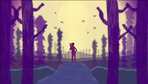
My sketches focused on either mountains or a space scene. I decided to go with the mountains, and after spending lots of time doing different variants and looking up additional tutorials on how to do good depth perception and shading for distant scenery, I settled on this scene. The character standing in the sunset reminds me of how much I like to look at sunsets myself. It helped me want to do the project justice, while also realizing that I didn’t want it to be super hyperrealistic. I was able to receive some feedback on my project from some friends before finishing the final project.
What I’ve learned
If anything, I have learned that I can in-fact make something entirely from scratch, even without someone telling me to. Being able to practice using Illustrator has helped keep up my skills in the program, and has also help me to learn new ones. I had a ton of fun making this, and am excited for the next bout of inspiration and motivation to hit for my next personal project. What will it be? Only time will tell.

The post Fantasy Sunset appeared first on Jared Rigby Design.

]]>
https://jaredrigbydesign.com/fantasy-sunset/feed/ 0
Vector Watch https://jaredrigbydesign.com/vector-watch/ https://jaredrigbydesign.com/vector-watch/#respond Wed, 27 Jan 2021 00:03:12 +0000 https://jaredrigbydesign.com/?p=465 Every project has a purpose. For some it may be a fun personal challenge, for others, it could be an assignment or a contract. For this project, it was a little bit of both. The assignment was to create a photo-realistic watch, but I took this as a personal challenge to push myself and do […]

The post Vector Watch appeared first on Jared Rigby Design.

]]>

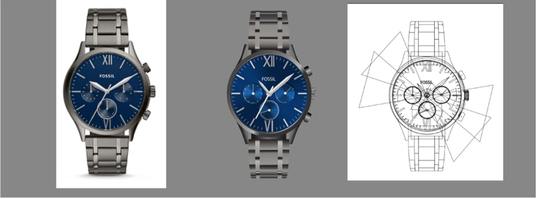
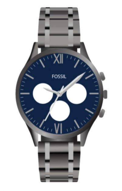
Every project has a purpose. For some it may be a fun personal challenge, for others, it could be an assignment or a contract. For this project, it was a little bit of both. The assignment was to create a photo-realistic watch, but I took this as a personal challenge to push myself and do something I had never done before. As I went through this process I realized there was so much that I did not know when it comes to Adobe Illustrator. My process goes as follows as I attempted to create a Photo-realistic Fossil watch.

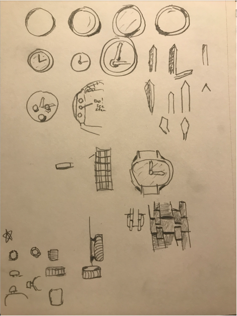
After choosing the model of watch I was going to use I started with some sketches. Although I already knew what this watch was going to look like, I needed to draw out the shapes, shadows, and highlights I saw so I knew where those things would go. Rather than having a thousand different ways of looking at the same thing, I dialed down my sketches to really get the shadows and shapes down. This helped me get started actually executing the watch in illustrator as I knew what shapes to use and how to style the shadows.
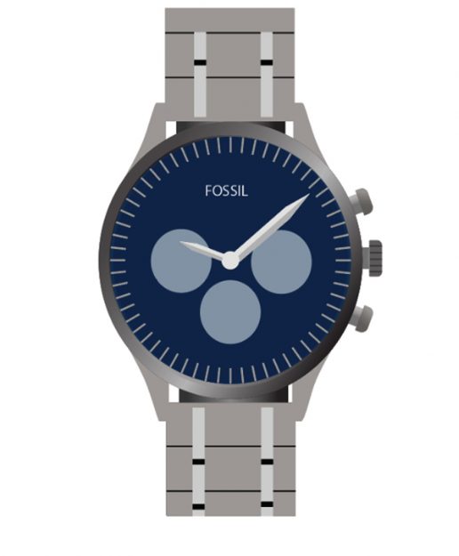
I after a few days of trial and error actually learning how to make those shapes I had already drawn, I finally had my first draft.


Suffice it to say, it was a rough draft. I had only messed with shapes and a tiny bit of shading, but I wanted somewhere to start before I dived into the highlights and shadows. I showed this draft to some people and got some mixed reviews, most of which were far from complete, but I knew that. It helped me to see where I needed to go next in my progress and gave me some good direction.


For my second draft, I made a lot of progress. I was able to work on the band as well as the watch face, but was still lacking on the mini clocks, the outside glass, and finishing the highlights. I got some feedback on what to do for the shadows on the band, and also on how to do a cool bowtie effect on the mini watches and glass, and then spent many hours tweaking and editing my watch into the final product.
After many hours I finally finished. I was able to take the feedback I was given and make the needed adjustments to finish it off. I was able to figure out how to do the bowtie glass shapes on both the small clocks and the overall outer glass, and was able to bring everything together. I showed my final product to a few people and 60% of the time at first glance were not able to tell that the difference between the reference photo and my vector graphic. There are still some differences as I didn’t want my watch to be exactly the same, but the shadows, highlights, and shading make for one convincing end result. I had a lot of fun with this project and am really excited for the next one. Bring it on.

The post Vector Watch appeared first on Jared Rigby Design.

]]>
https://jaredrigbydesign.com/vector-watch/feed/ 0
ELEVATE-Overview https://jaredrigbydesign.com/elevate-overview-2/ https://jaredrigbydesign.com/elevate-overview-2/#respond Wed, 16 Dec 2020 22:25:20 +0000 https://jaredrigbydesign.com/?p=347 Project purpose or objectives During the last few months, I have had the opportunity to participate as a Director for the Elevate Competition. For nearly 4 months I was able to be head of Digital Content Creation and to help the other members of my team prepare for the Competition. So what is this Elevate […]

The post ELEVATE-Overview appeared first on Jared Rigby Design.

]]>

Project purpose or objectives

During the last few months, I have had the opportunity to participate as a Director for the Elevate Competition. For nearly 4 months I was able to be head of Digital Content Creation and to help the other members of my team prepare for the Competition. So what is this Elevate Competition? Every other semester Brigham Young University-Idaho hosts an Interdisciplinary Competition for Social Change. Teams made of students from all the different Colleges on campus come together to answer a question that deals with social change. This question has ranged from Mental health, Forming relationships, and for this semester’s competition; Finding Balance.

A lot of the planning work had been completed back in the months of January to April, prior to COVID-19 canceling a lot of our plans for the spring contest. Our spring competition was pushed back this past fall, and I had the opportunity to once again participate to see this contest come to life and actually happen.

The project (samples of the work produced or the final product)

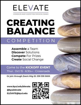
Since most of the creatives were completed before, there wasn’t as much to make in terms of posters and flyers to make. I was able to redo a previous flier for our team to hand out to advertise for the contest, but that was about the extent of the graphics and design I was able to do.

Instead, my time was spent with the actual advertising and promoting of the event, and making the final preparations. A good portion of the contest would be done virtually through Zoom, and it became my job to be the technology director to help make sure everything ran as smoothly as it could.

Challenges encountered in completing the project

With a contest over Zoom however there became lots of challenges. These challenges didn’t present themselves until the actual competition when we found that many of the rooms we had for the presenters had audio and video issues. I spent a lot of time working with others, both from my team and the teams of AV and audio employees on the BYU-Idaho campus to fix these issues, and we were able to work things out.

Project processes

Each week our team would meet via Zoom for about an hour to make assignments and plan things out. We were able to go from having no idea how to host a hybrid competition to be able to have over 200 hundred participants, with about 40% over Zoom. Each week we made new progress for how we can run a virtual event, and in about 4 weeks we hosted the first part of the contest, the kick-off event. This took place on the BYU-Idaho campus, and it is where the participants first gathered to form their teams. Then, 2 weeks later we hosted the contest itself, where most of the technical issues first presented themselves as explained earlier. The contestants were able to present their ideas to their judges, and then the top 5 teams were selected the following week. The Finals had the most audio and video issues to date, but at least it taught us some valuable lessons on how to prepare. After the Finals and a winner was chosen, we immediately went into evaluation mode to figure out what went well, how to improve, and what could be done better for future competitions if they happen in like manner.

Fall 2020 ELEVATE winners

An overview of the experiences you had

Overall I loved working with Elevate. I was able to work on my design skills and put to practice things I have learned in a real-world setting. Instead of working for a grade, I was working to accomplish something, which has allowed me to become a much better designer and to work well with a group or team. It was a neat experience to meet all virtual given the current situation of the world, and I was able to meet some great people.

What insights or takeaways you gained from the project

With this project being so virtual and different than what I’ve been used to, I have learned a lot of patience. This applies to both people and technology, and without it, the project will fail. I have gained a much greater appreciation for digital communication and will take the skills I have gained into future projects and careers.

The post ELEVATE-Overview appeared first on Jared Rigby Design.

]]>
https://jaredrigbydesign.com/elevate-overview-2/feed/ 0
ELEVATE-All Wrapped Up https://jaredrigbydesign.com/elevate-all-wrapped-up/ https://jaredrigbydesign.com/elevate-all-wrapped-up/#respond Tue, 01 Dec 2020 02:34:48 +0000 https://jaredrigbydesign.com/?p=338 It is very interesting how much the thoughts of a project coming to a close, without actually being finished. Even though the official ELEVATE event was completed a couple of weeks ago, our story wasn’t quite finished. The first thing that we had to do was make sure that everything that we had was documented. […]

The post ELEVATE-All Wrapped Up appeared first on Jared Rigby Design.

]]>
It is very interesting how much the thoughts of a project coming to a close, without actually being finished. Even though the official ELEVATE event was completed a couple of weeks ago, our story wasn’t quite finished. The first thing that we had to do was make sure that everything that we had was documented. We continued to post on social media and began preparations for the next competition.

We started by reviewing everything that went well and things that could be improved on. We spend a good long time writing up some evaluation reports so we can talk about it as a team, in the hopes that it would help the next competition go even better if the circumstances are similar. We even spent some time talking about possible topic ideas to get ahead start on the planning process for Spring semesters ELEVATE. Although I will be unable to participate as a director, I gladly will pass the mantle onto other able-bodied souls with the same desire to help other students create social change.

The post ELEVATE-All Wrapped Up appeared first on Jared Rigby Design.

]]>
https://jaredrigbydesign.com/elevate-all-wrapped-up/feed/ 0
ELEVATE Finals-Fall 2020 https://jaredrigbydesign.com/elevate-finals-fall-2020/ https://jaredrigbydesign.com/elevate-finals-fall-2020/#respond Sat, 14 Nov 2020 19:47:45 +0000 https://jaredrigbydesign.com/?p=332 It is always amazing to see how things can come together to allow an event to happen, if with technical difficulties, and even complete failures. Yet despite some of these setbacks, the ELEVATE finals happened, and we have a winner! Very similar to the ELEVATE competition that happened a few weeks ago, the Finals are […]

The post ELEVATE Finals-Fall 2020 appeared first on Jared Rigby Design.

]]>
It is always amazing to see how things can come together to allow an event to happen, if with technical difficulties, and even complete failures. Yet despite some of these setbacks, the ELEVATE finals happened, and we have a winner!

Very similar to the ELEVATE competition that happened a few weeks ago, the Finals are a place for the top 5 teams to present to a panel of judges consisting of members of BYU-I faculty. We had 6 judges to help determine which of the ideas from the finalists could be presented to the President Executive Group (PEG) for the possibility of the ideas being implemented into BYU-I. The 5 finalist teams had a week from the first competition to review, reflect, and refine their presentations for the chance to win at the Finals. Of course, not everything went smoothly, but we were able to make it work.

 The hardest challenge was making it possible for people to present over Zoom and in person at the same time, while also allowing the audience to join in and view from Zoom as well. The reason it was set up this way was to allow people to see the presentations, while also keeping people safe during this pandemic by not smashing tons of people into the same room. I spent about an hour trying everything to get things all set up for the presentations, and with the help of the AV crew on campus, we were finally able to start, albeit 15 mins late.

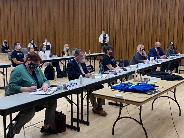
Our panel of judges

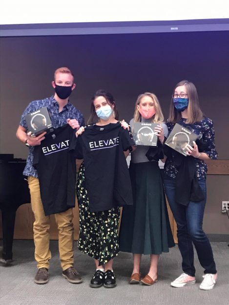
The presentations then went on for the next hour or so, which consisted of the presenting of the idea, and then a Question-and-Answer section from the judges. After the final team presented, the judges came together and determined a winner. The winner for this semesters ELEVATE competition was Inukshuk, an app that could be created to help students keep track and record their progress on the journey to find balance. Not only did they win the competition, but they also won some cool prizes from the BYU-I bookstore.


Team: Inukshuk

I am very grateful to see the “final” event of this semesters ELEVATE finally come to fruition. One may say that we are done, but now we get the opportunity to start planning for the next ELEVATE competition for Social Change!

The post ELEVATE Finals-Fall 2020 appeared first on Jared Rigby Design.

]]>
https://jaredrigbydesign.com/elevate-finals-fall-2020/feed/ 0
It’s Go Time https://jaredrigbydesign.com/its-go-time/ https://jaredrigbydesign.com/its-go-time/#respond Sun, 01 Nov 2020 00:51:10 +0000 https://jaredrigbydesign.com/?p=323 Months of planning, stress, and a good amount of hassle finally came to a somewhat conclusion. On Thursday, October 29th, the ELEVATE competition was a go! We were able to get all 38 teams to their assigned rooms with their judges for them to present their ideas for how to create balance. Now how did […]

The post It’s Go Time appeared first on Jared Rigby Design.

]]>
Months of planning, stress, and a good amount of hassle finally came to a somewhat conclusion. On Thursday, October 29th, the ELEVATE competition was a go! We were able to get all 38 teams to their assigned rooms with their judges for them to present their ideas for how to create balance.

Now how did everything work given the current pandemic? That question has been on our minds for a long time. With the competition on Thursday, we had to have everything squared away by Tuesday night which was the Director Preview. For that meeting, one member from each team met with 2 of our other directors for them to receive their final instructions on how to present, whether that would be in person, over Zoom, or a mix. Then, in a last-minute meeting on Wednesday, we received our final assignments for our stations, and Thursday was all set and ready to go.

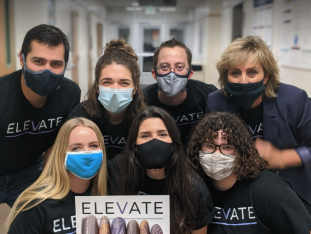
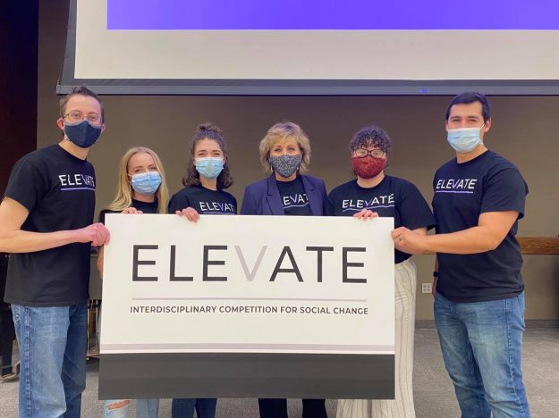
The ELEVATE Directors

Now of course it would not be any sort of event without any difficulties, right? You would be correct. Our first hiccup was that 2 of the scheduled rooms were not actually set up for Zoom, so there was neither sound nor video for the projectors. We scrambled to find other rooms to use, and thankfully by the grace of it being a non-busy night on campus and the I.T. Department of BYU-Idaho, we were able to get new setups for the judges and teams. I was stationed outside one of the 4 rooms to get teams checked in prior to their presentation, and also a runner for any other things we needed for the other rooms. We were able to get all 38 teams to present, and our lovely judges were there to help choose the top 5 teams for the Finals, which will be held next week.

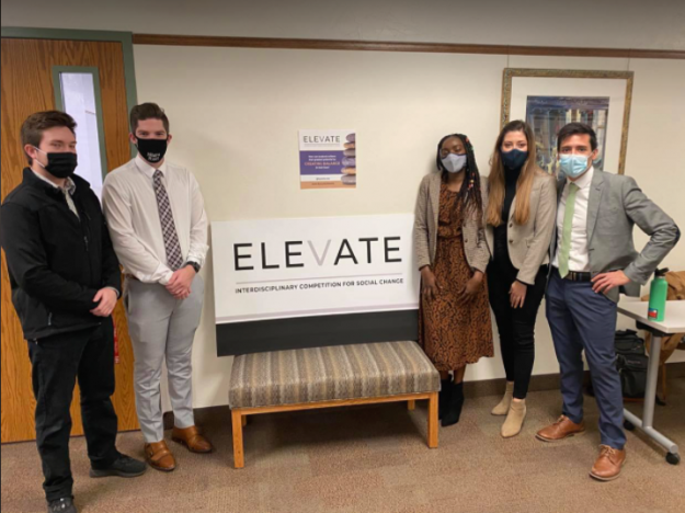
One of the participating teams.

It’s amazing how much stress can accumulate over the months in preparation for an event such as this. However, the feeling of relief once it’s done is an amazing sense that I don’t ever get to experience. I am glad that I have been able to help organize this contest and am really excited to get to help run the finals next week. The teams did such a good job on their presentations, and we are so grateful for their participation.

The post It’s Go Time appeared first on Jared Rigby Design.

]]>
https://jaredrigbydesign.com/its-go-time/feed/ 0